Bank Card Security System (BCSS)
For 40+ years, Prime Factors' Bank Card Security System (BCSS) has been a primary way banks and processors manage the Hardware Security Modules (HSMs) behind encrypted payment infrastructure, the machinery that secures communication between banks, processors, and end terminals like POS and ATMs, including the technology on chip credit cards. I'm leading the end-to-end UX redesign as it migrates from a visual Windows interface (ported from a DOS interface in the '80s) to a fully modern web interface, and in the process taking the opportunity to remove legacy features, reimagine structure and workflows, and create a product rebrand to serve as a new flagship product for the company.
- CompanyPrime Factors
- RoleLead UX Designer (and de facto PM)
- StatusIn progress · 2024–2026
- ScopeLegacy analysis, requirements, interface paradigm, full UI redesign, pattern & visual libraries, UI technology guidance, product repositioning
The system I found
Software that has served the same critical function for four decades accumulates two kinds of depth. The first is earned, an extraordinarily complete feature set shaped by every real-world demand banks, processors, and auditors have made of it through a broad evolution of techniques and technology. The second is incidental, built on technical foundations long since passed, features created one on top of the other while older approaches fell from favor, fast workarounds becoming system linchpins, organic feature density like an ancient garden in need of pruning, where expertise means having memorized the paths that aren't findable.
This is also a highly secure environment. The product manages HSMs, the physical roots of trust for encrypted payment traffic. Every design decision inherits constraints from security architecture, compliance regimes, and operational procedures at financial institutions. You do not get to simplify by removing the compliance complexity, that complexity is the product.
The design problem is to internalize the complexity and depth of the product, then present only the relevant portions to the agents and roles that use that portion of the complexity, while still supporting the full breadth of legacy features still in use.
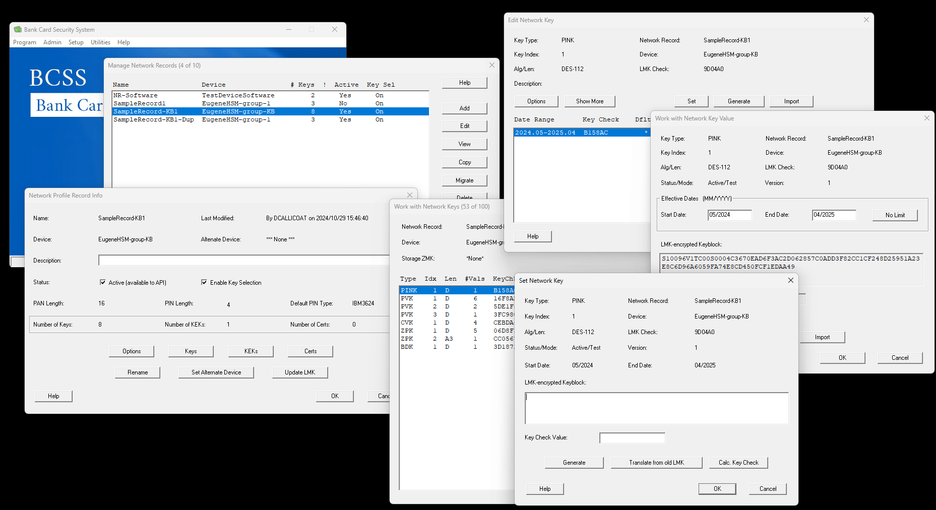
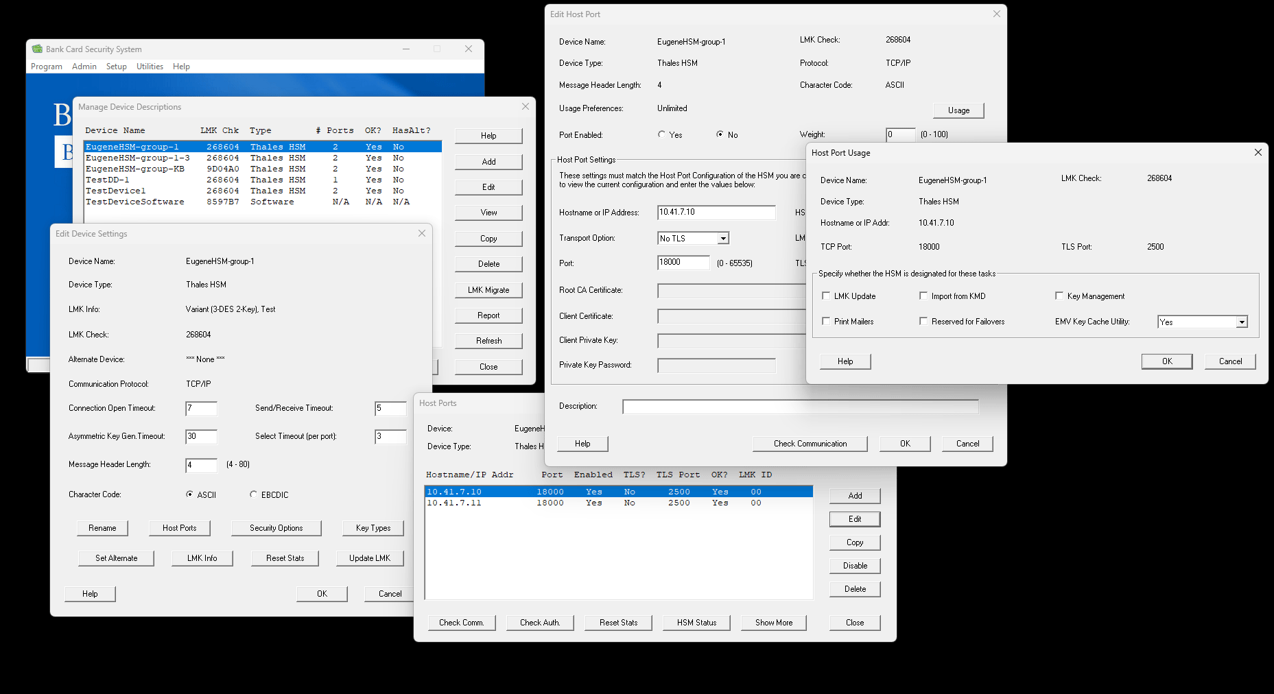
Constraints
- The product team was very lean, a single developer and a single product-support role, coupled with a newer executive business lead from the hardware group that had purchased the company, with less experience launching software products. Both sides had almost no experience with web products, technologies, or modern interaction patterns.
- My changes had to live solely in the display layer, leaving the systems underneath untouched, while we simultaneously and fundamentally changed several core concepts of hardware and network modeling.
- Feature requests were plucked and built from a backlog without strategy, and due to the secure nature of the product, no data could be collected about how it was being configured or utilized.
- My developer had no experience with JavaScript or other web UI technologies. We eventually hired a second developer to build the web UI, but they were quite junior with no real experience building web UI, so my visual solutions had to be tailored to our technical constraints.
Mapping it
It was immediately obvious that beyond the larger goal of moving the software to a web platform, there hadn't been much work on deciding what that meant. The existing and new team members were still developing their communication with each other, and I needed to solve that basic problem before we could begin understanding what the product requirements needed to be. And since there was no project manager role in the company, I would need to fill that role as well to design the product.
Documenting the experience
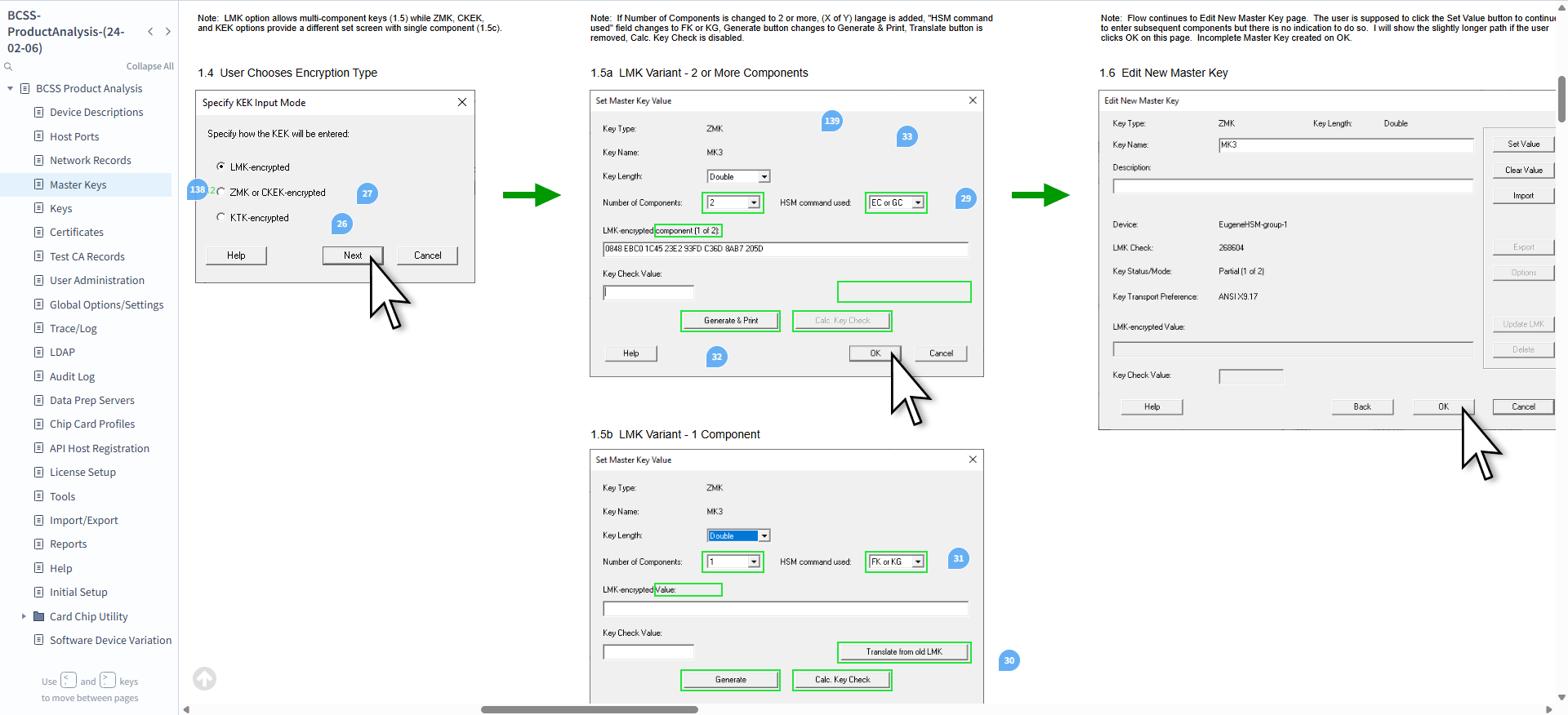
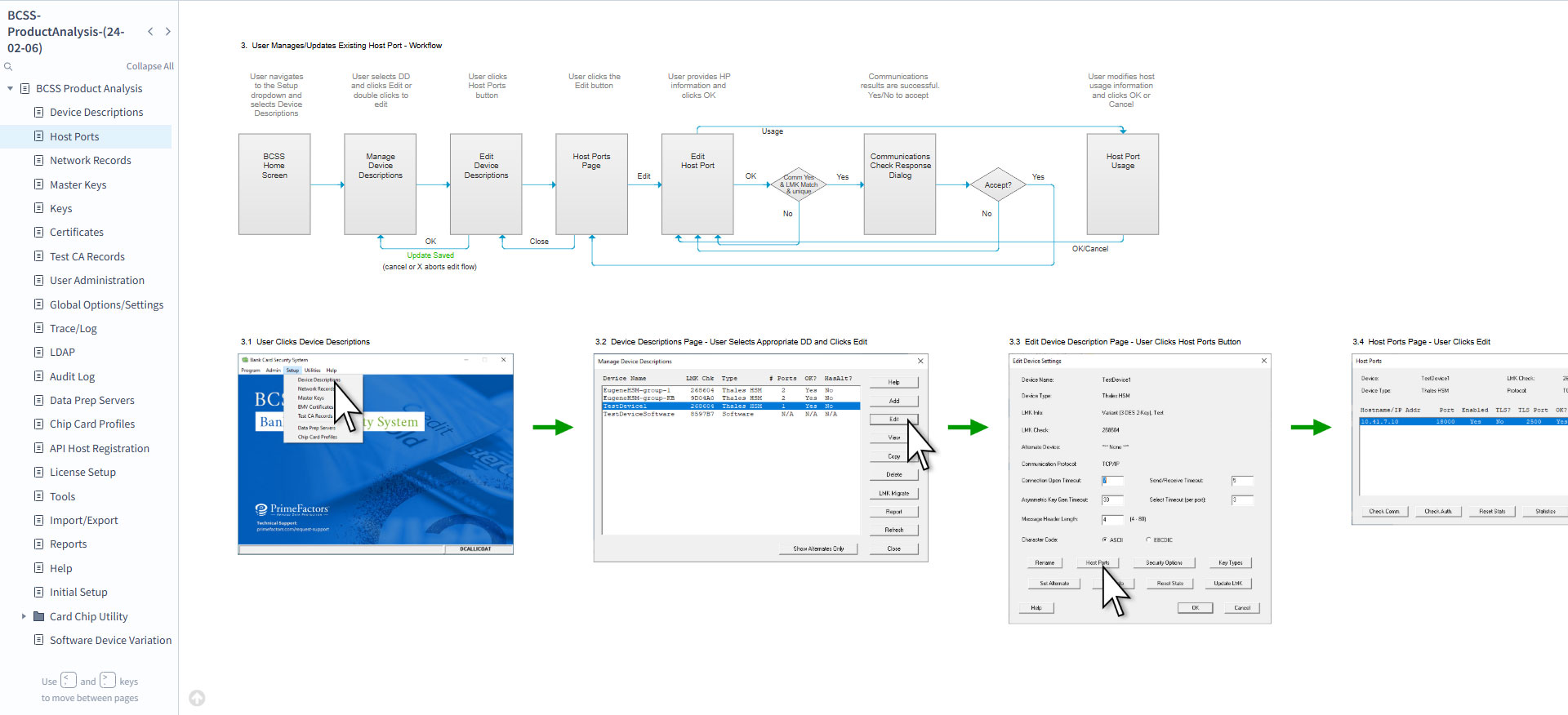
No documentation existed, so I decided on the approach of a product-wide audit, screenshotting each step of every workflow and tool available in the product and grouping them as user stories. This mapped the product for me, but more importantly it created the foundation of communication between the team. We would look at each screenshot together, identify each feature shown, let each member question and determine which features were still being used, and generate a list of questions as action items for each member to return with. Comments were tracked as visual pins on the screenshots and associated with requirement groups such as Discuss, Validate, Add, Remove, Change, and Phase 2.
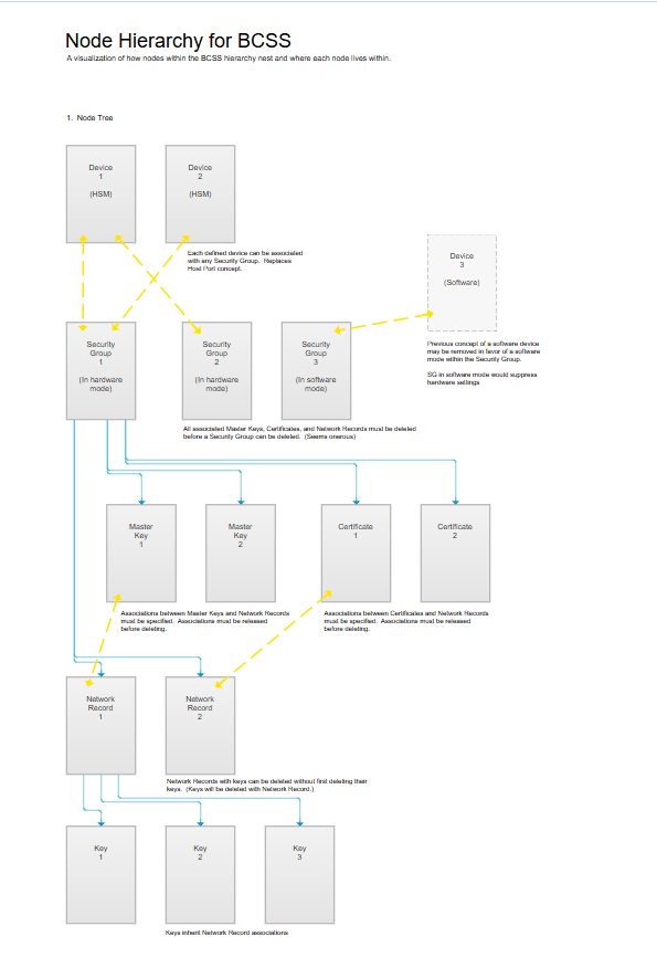
In addition to the team audit, I could ask questions about specific roles and their scopes, and start to understand which pieces were being used by whom and when. I could also begin to see node hierarchies emerging that appeared unstructured in the product.
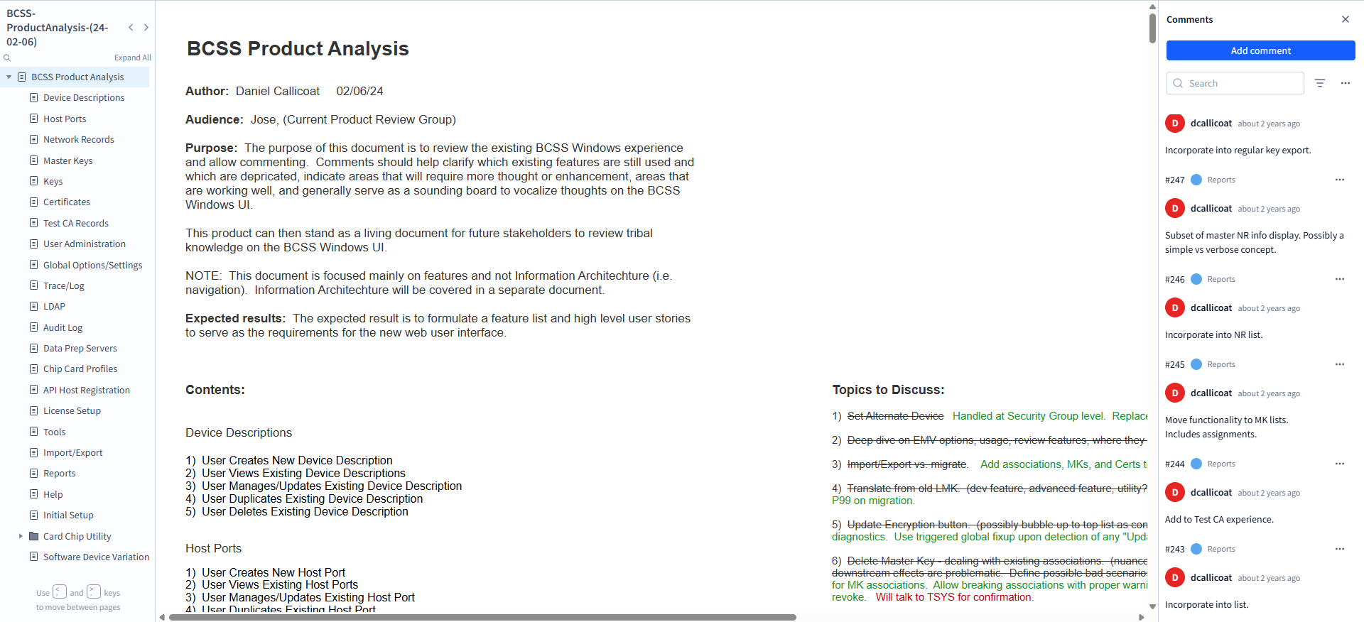
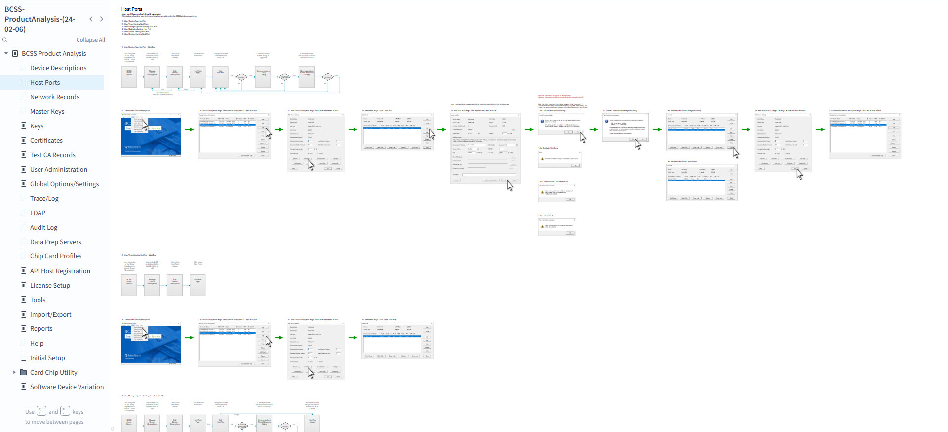
Problems to address
During analysis, several primary issues arose:
- Visual Windows interactions are modal in nature. Each workflow step generates a new modal view stacked on the last, so a single workflow might generate eight stacked modals, each needing to be closed in sequence to return to the start.
- Entities in the product were deeply hierarchical (node A contains node B contains node C, and deleting A deletes B and C), but screens depicted all the As together flatly, then all the Bs on another page, making the hierarchy and its interaction matrix cognitively complex to hold.
- Modals were shared by different workflows, so any particular workflow carried unrelated options and pathways, inflating cognitive load.
- Many product features weren't used by any client; they were convenience features the product developers used while testing, living in the UI instead of behind a test flag.
- There was no notion of user roles in workflow organization, and feature groupings were categorical rather than customer-driven.
- Many features were outdated or built around restrictions that no longer existed, creating unneeded complexity.
- Four decades of feature conglomeration required a history lesson with every design explanation. The team had no freedom to think about features with fresh eyes.
The design
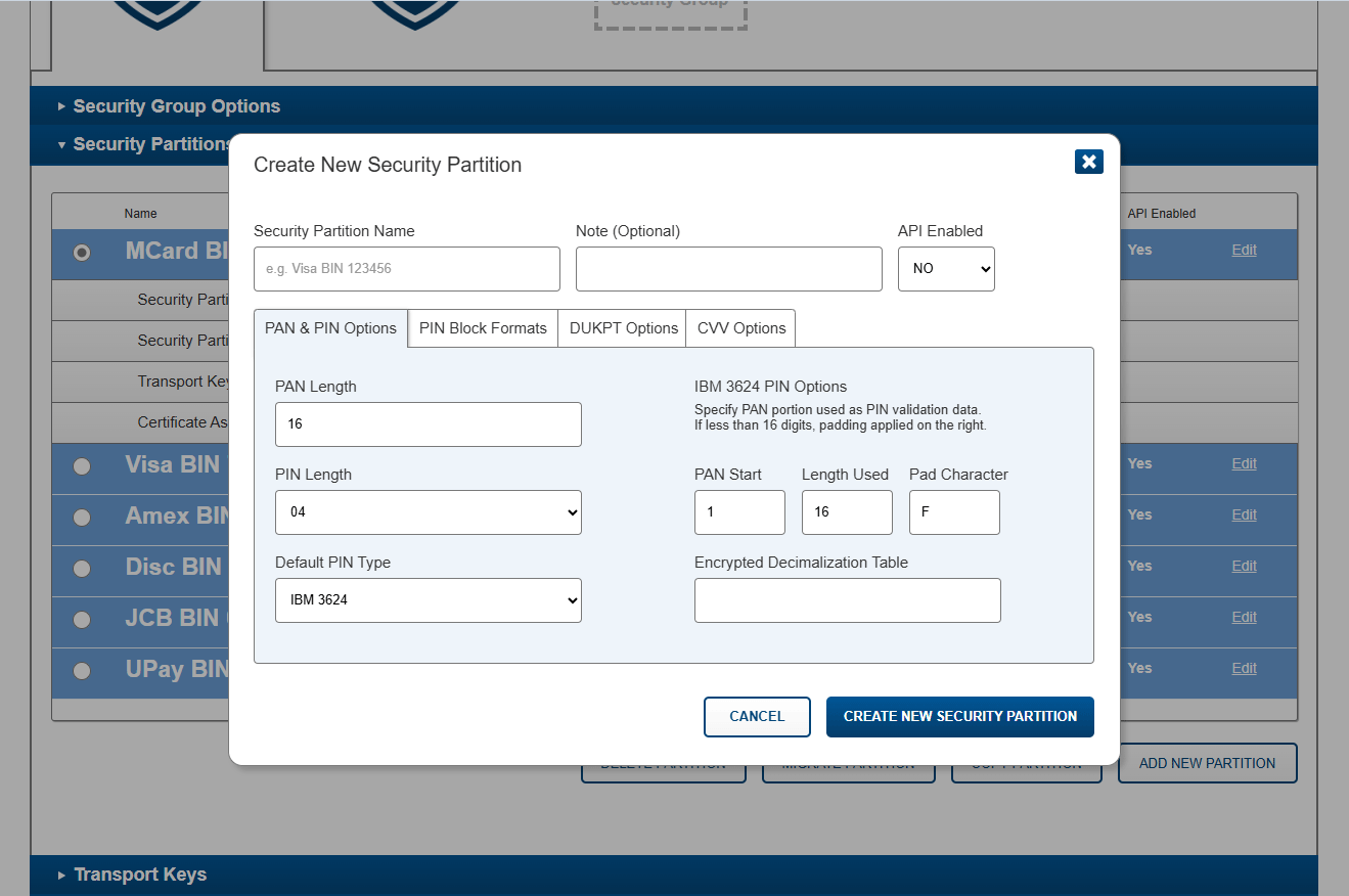
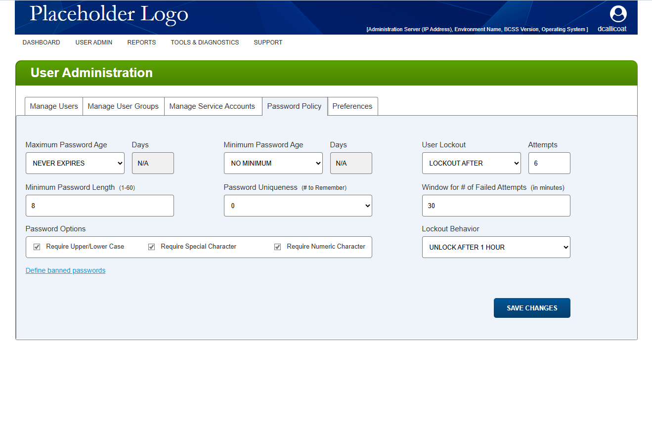
This is a full-service redesign, not a re-skin. The work starts with reconceptualizing the interface paradigm itself, reorganizing the product's information architecture around the user's work rather than the system's internals, increasing customer focus, and reducing cognitive complexity, and runs down through every tool and utility in the product, from sketch to grey box to pixel-perfect design.
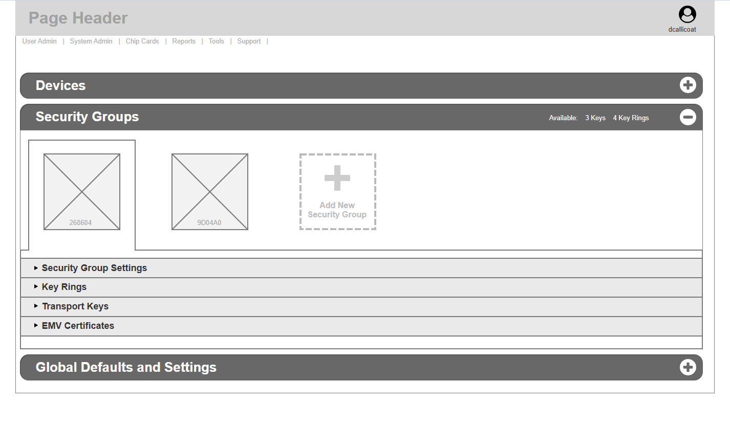
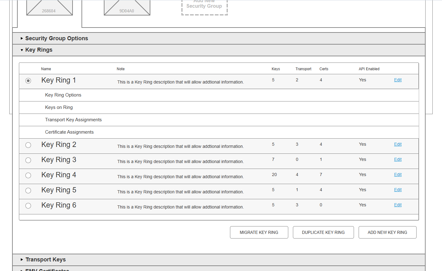
I started by exposing the inherent data hierarchy to the team, and how that formalized the behavior of nodes within the hierarchy. This was a large first hurdle, as it inverted the way the team had conceptualized the product, but it allowed the behavior to become visually obvious within the structure of the UI, without actually changing any data structure. This greatly improved usability.
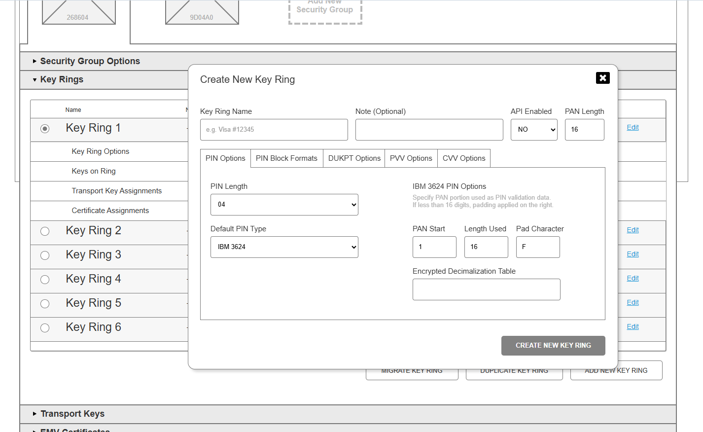
The second requirement was to flatten the existing UI into a single navigable page concept over which intentional modal workflows could be laid, avoiding the modal-over-modal problem. This was complicated, because the logical foundation was a DOS-era single-screen "choose A for feature B" tree that ran quite deep. But I realized the depth related to user roles: agents tend to work at a specific level of the tree, not navigate up and down it. So page navigation could be represented as a decision tree expanding into a targeted role interaction, keeping direct focus at each expansion, again without changing the data structure. Once an appropriate focus was settled, the role's workflows could be layered over the page as modals with clear direction, without interacting with the surrounding page or unrelated features.
Since role definition was determined by org size, I started by dividing the two required roles, User Admin and System Admin (which are mutually exclusive), at login, each with its own initial view. I then created a top-level visual state indicating the navigation pathways into ever-more-atomic roles, so a lone System Admin has visual access to the entire system while specialized roles in large orgs can easily discover their particular area of focus. Navigation could then mirror a strict permissions hierarchy, gating access to only permitted sections without trapping any required feature behind a permission wall.
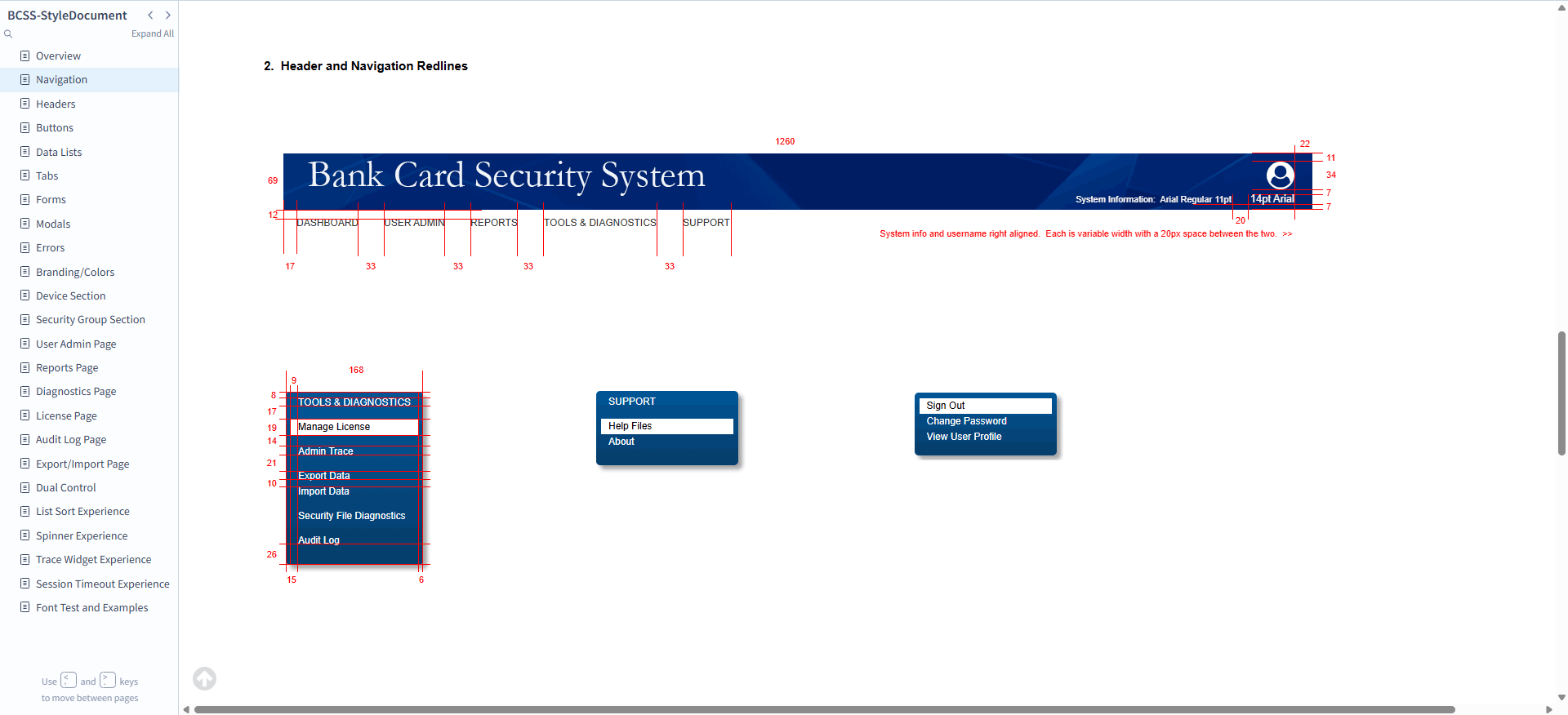
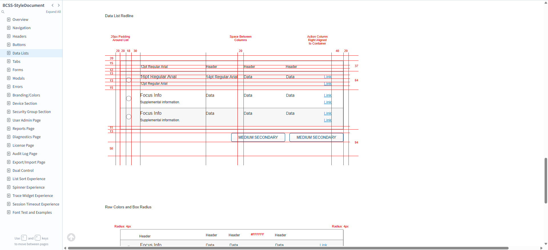
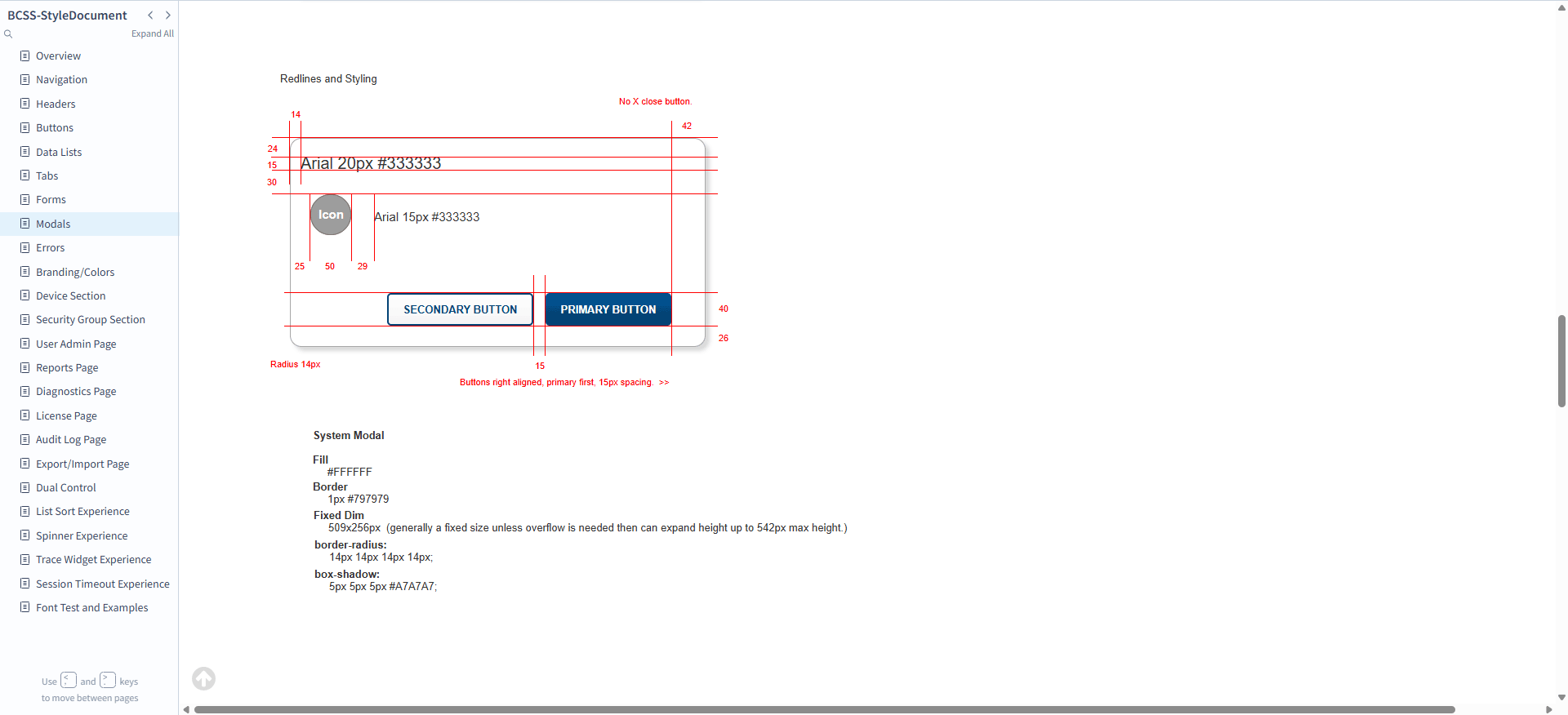
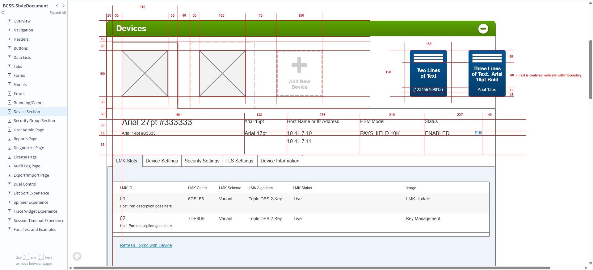
I then created a modern visual language (respecting the product's existing style guidelines) and an interaction pattern library tailored to our technical achievability, a full design system, with an accompanying site style guide carrying deep redline definitions for every element to ease production.
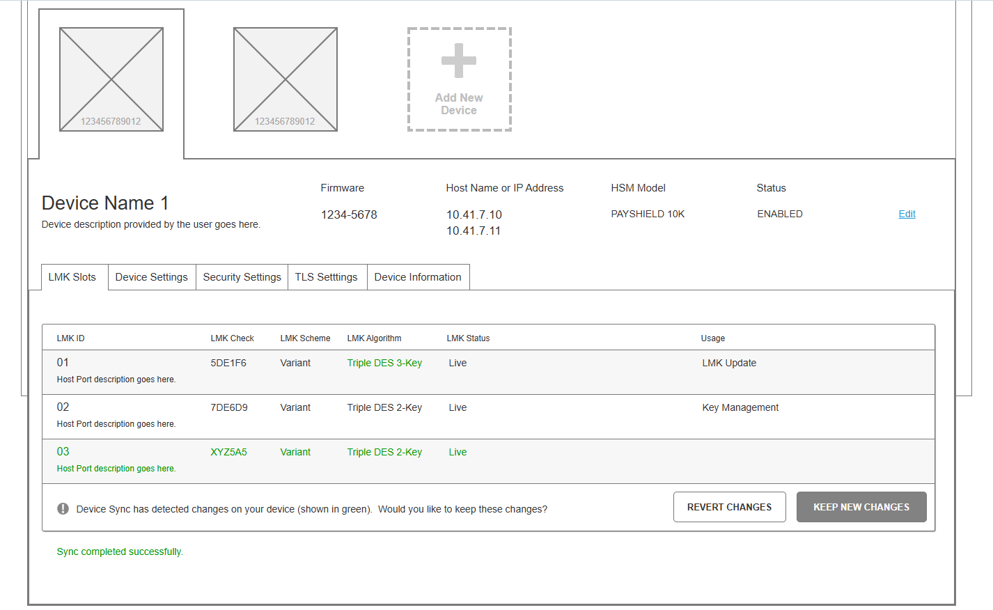
The technical knowledge ran deep, so I had to synthesize my grasp of it into entirely new workflows, then sculpt them into better ones with the team, without any real requirements to work from. The process was summed up by my manager as "Go do your magic," with accompanying hand-waving. But I was able to capture the full breadth of the legacy product in the new design while strategically removing unused and unneeded features, visually represent the node behavior hierarchy, create user-role-focused navigation and workflows, add the new hardware concepts, and broadly elevate the usability of every feature of the site.
From sketch to grey box to pixel-perfect
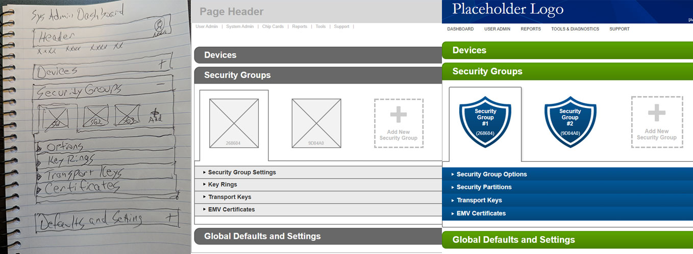
Grey-box design pass
Final design pass
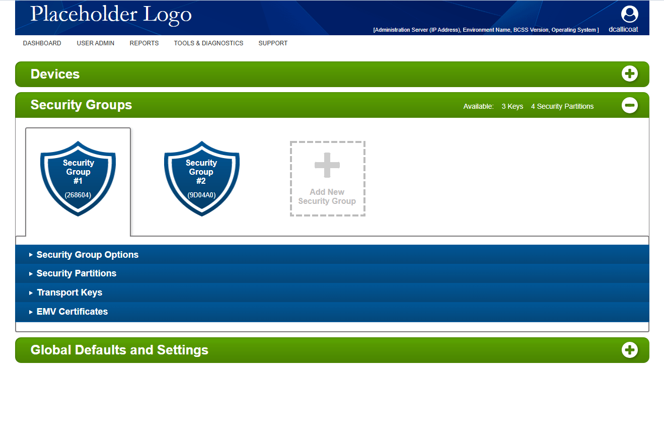
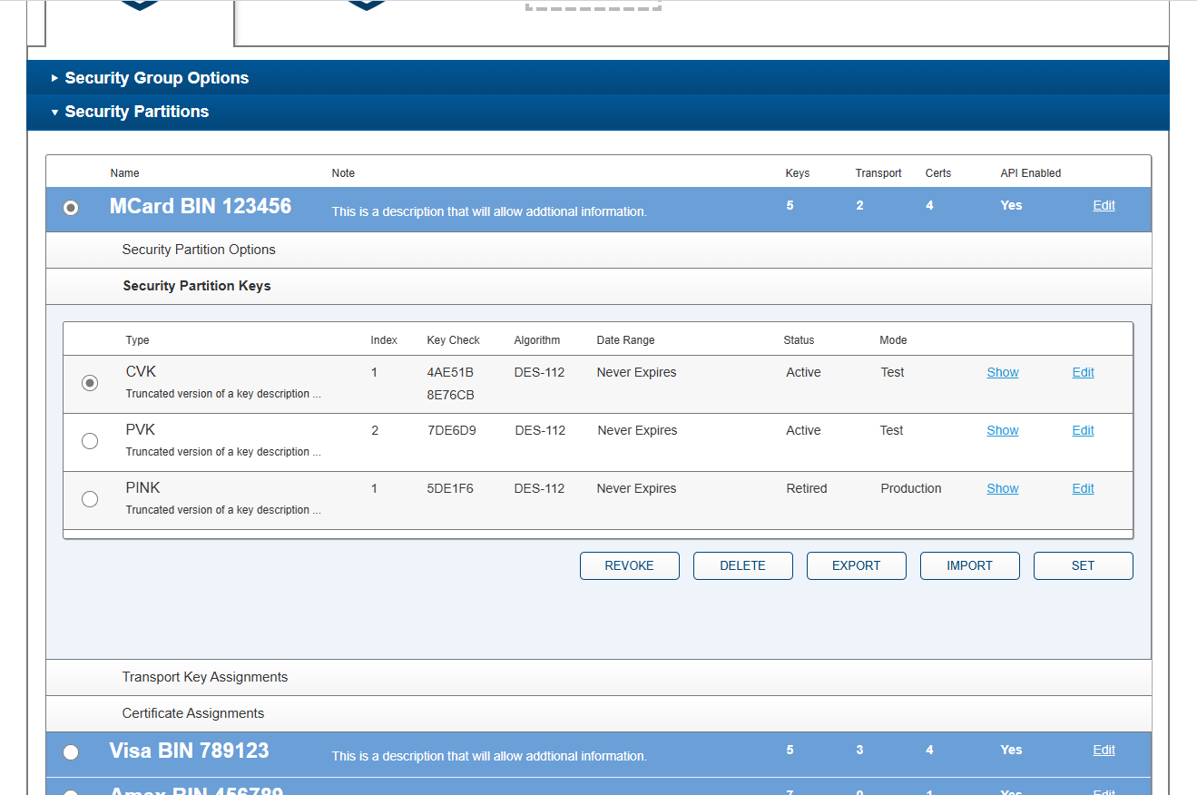
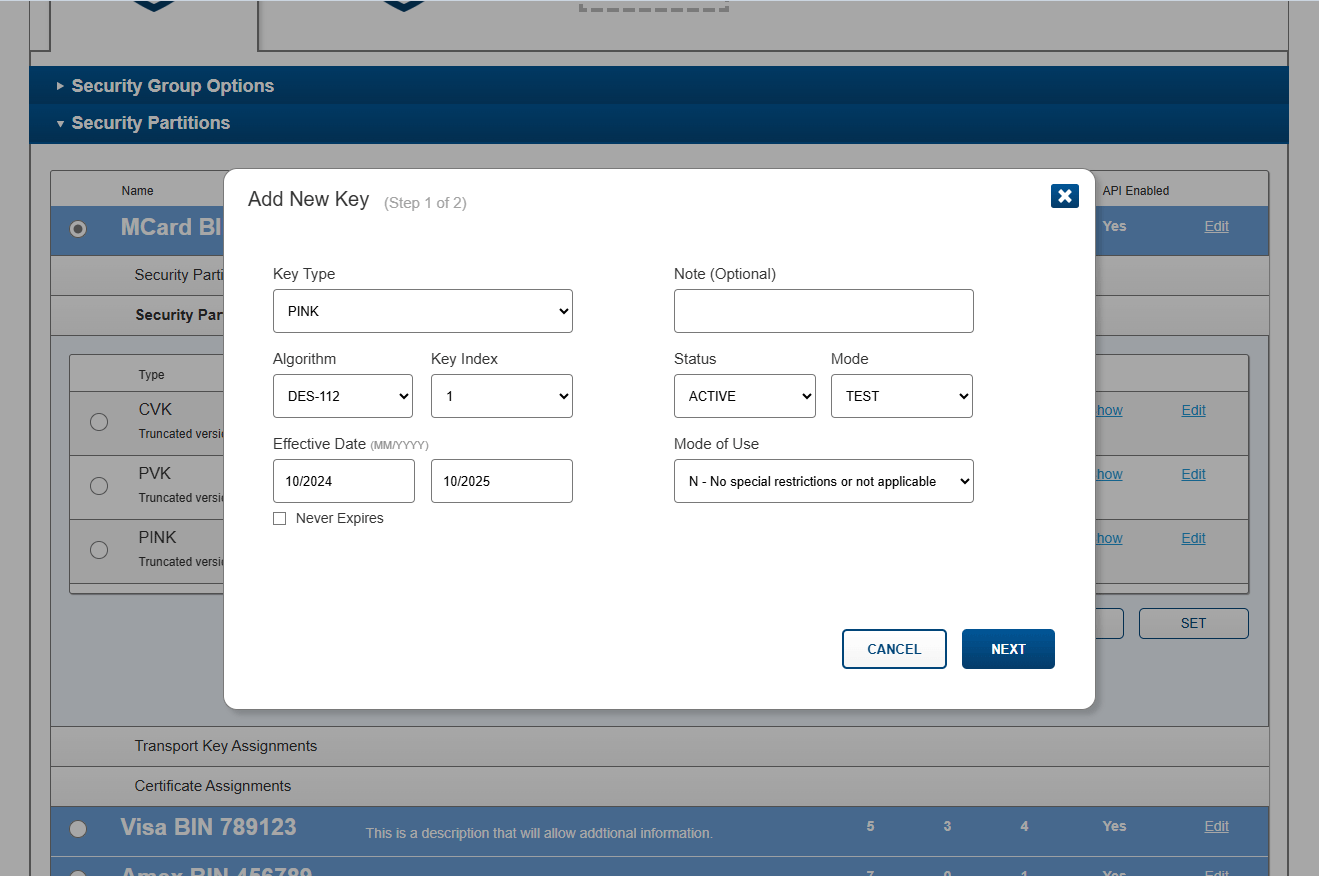
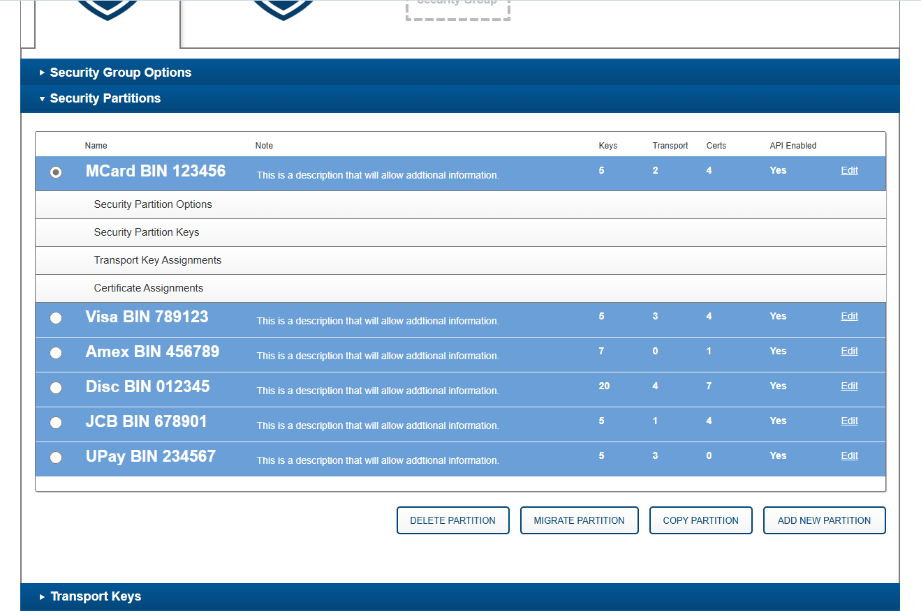
Style guide and pattern library
Adoption
My initial fear, working with a product that had existed essentially unchanged since the early '90s and was staffed by the same team that created it, was deep familiarity bias and sentimental attachment. This did not prove true. The production team welcomed change (though occasionally held to old familiar patterns), and the business group funding the update was extremely pleased with the result, which was so conceptually different that it would allow them to sell the new design as a new product altogether, with new licensing, freeing them to move forward with their product marketing goals at an accelerated rate. This then expanded into a full rebranding push, handled by the marketing team's own design department and later incorporated into the product design when complete. Branding shown in the product design here is fully generic, to separate it from the old BCSS product.
Outcomes
This engagement is in progress, and this page reports only what is standing today rather than projected results:
- A structural analysis of the legacy system deep enough to generate the formal requirements base for the redesign, along with detailed documentation of the legacy product and all the discussions and decisions that generated those requirements, constructed from around 1,000 screenshots assembled into 114 user stories and 114 user flow diagrams, which generated 250+ captured comments and, from those, 189 action items.
- Open and legacy issues surfaced through that analysis, tracked and resolved as part of the redesign rather than around it.
- A reconceived interface paradigm, carried through every tool and utility from sketch to grey box to pixel-perfect design.
- Entirely new design system with pattern and visual libraries, styling, redlines, and behavioral systems that define future site design and the conversion of the company's other products. The design system document includes 24 sections, 54 subsections, and 215+ pattern illustrations.
- The redesign generated a new flagship product for the company, one that its existing products can now be mapped to and repurposed as a new suite of encryption products.
- Since usage and other traditional metrics aren't tracked by the company, the main success indicator is its ability to repackage the new product as a subscription-based service and drive sales into a recurring model, establishing the company's long-term revenue goals and a path for its other products to follow. In this way the redesign greatly overperformed expectations, which never included this scope.
What I'd tell you about it now
Deep legacy software is a fascinating challenge. You need to internalize decades of complexity and conglomeration, see how we got here without judgment, then, with fresh eyes, see the actual problems to be solved and roles to be supported, stripping away the problematic histories while leaving the good ideas and depth, and restate them in a new visual language that is clear, concise, and correctly focused. This type of complexity synthesis is well suited to my strengths.